Project
Design of a tool to help EV owners/ prospective owners, compare and energy products offered by UK providers.
Reacting to growth in the electric vehicle market
rightcharge is an early stage start-up on a mission to make it easy choosing the most efficient, cost effective and environmentally friendly way of charging an electric vehicle.
Set-up by former Octopus Energy employees, rightcharge offers guidance to select the best home charging points, putting the user in touch with a nationwide network of EV qualified electricians.
This project extended their business proposition by designing a tool which would compare energy tariffs designed for ‘smart charging’ of EVs, and help the user understand the cost of electricity to charge their car, separate from running their home.

THE CHALLENGE
More than the tool
The first challenge of this project was to understand the thinking behind the existing digital product, which offered users various home charging points and installation services, and how this experience would connect to the new proposition.
The second challenge was to clarify with the owners what the business proposition was for the new product, where the opportunity was, and how they expected to generate revenue.
The third challenge was to design a tool which would form the basis of a future experience which wasn’t part of the initial development stage of the business.
MY ROLE
Design Lead / Product design
Originally engaged to design a price comparison tool, my role evolved quickly into a product design one, where I needed to guide the owners to think about aspects of the overall service offering and target users before focussing of the user experience of the tool itself.
This is what I particularly enjoy about working in a start-up environment, whether for seed start-ups, or for established companies doing something new, the fluidity of the situation allows me to bring to the challenge my experience and expertise to fill gaps in the thinking.
KICK OFF
Where to start?
Timelines were ambitious so I needed to ensure that rightcharge and I were aligned on what would be delivered and when, in order to realise the emerging and crystallising vision.
The first four steps I took was to:
1. Understand their vision, how they expected this new tool to work, what it would need to do achieve the business and user goals.
2. Assess the existing online proposition to clarify and agree how this new tool would, or would not, align to the existing experience, and build upon the business proposition.
3. Competitor analysis to see how existing compare sites work and deliver results and interactions.
4. Setup a clear sprint plan to control the process and give visibility to all parties, including the offshore development team, as to milestones and deliverables.
CLARIFYING THE OPPORTUNITY AND UNDERSTANDING THE USER NEED
Understanding the vision
After a number of workshops with the owners clarified the core vision for the delivered experience. That rightcharge will provide something which no other comparison site or energy supplier currently provides - a breakdown of electricity costs between EV charging and general home use.

Illustration from early wires showing the energy breakdown model
Discover, explore, learn.
While this transparency is interesting for a user to know, the value it delivers is when it’s combined with the ability to explore and change the variables determining this figure, so as to understand how changes in user behaviour and the different charging point equipment affect the options.
For example, having the ability to ‘smart charge’ your car through a compatible home charge point, while using an energy tariff designed for off-peak optimisation, could increase use of clean energy, reduce energy costs thereby optimising value to users.
This became known as ‘The Secret Sauce’ (a working title which didn't make it past the market lens!)

Screen grab from early wires showing the Secret Sauce concept
Who are the users?
How did rightcharge know they were aiming to service a user need?
It turned out that there wasn’t a great deal known about the profile of owners of EVs or the motivations of potential owners.
So I conducted some research from existing reports in the market and had discussions with EV owners I knew (and those thinking of going EV) to better understand attitudes and motivations.
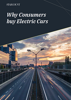


Research material on the motivations of the EV customer/ potential customer base
From this research four primary categories of motivation emerged. While only a starting point, it provided enough to generate personas and user stories to reference as we moved into design.
Tech enthusiasts
Self-confessed geeks. Tech is their hobby, their profession, their life. They have careers in areas such as computer development, programme design, technology and are often entrepreneurs. They are excited by the latest developments in gadgets, computers and technology trends.
Climate Conscious
People who see activism as their duty. They are concerned with sustainability and reducing the impact human life has on the environment. Pollution is a concern for them and they are excited about innovation and efficiency to overcome these challenges.
Motorheads (Car enthusiasts)
As you would expect, are ‘mad about cars’. From Formula 1, rally driving, supercars to motorcycles, they are fanatics. Passionate about driving. They want to feel like their favourite racers, Lewis Hamilton, Guy Martin etc. They are proud of their car and both brand name and functionality are very important to them. Motorheads decisions are fuelled by a love of cars and a need to explore the newest innovations in motoring.
Savvy Spenders
Not necessarily “penny pinchers”, Savvy Spenders are exactly that. Savvy with their money. They will consult many sources, and do their research to ensure that they get the best value for money as they meet their family travel needs. They love entering competitions and seeing what their money can get them. Savvy Spenders are conscious about making their money go further and taking considered decisions about purchases.
PERSONAS
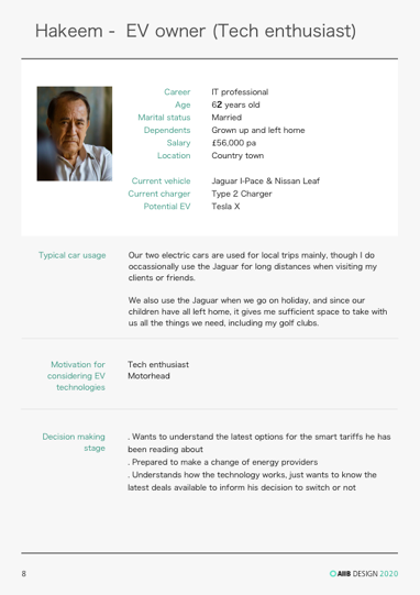


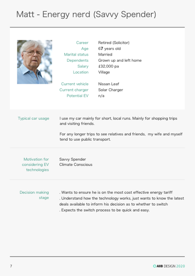
Screens shots from the personas emerged from my research findings
In addition to these four types of user, they fell into one of two categories: those who have an EV, and those thinking of buying an EV.
In discussions with the business, we imagined how a potential EV owner would benefit from the rightcharge service in driving their decision making. rightcharge were not intending to make car recommendations, but could inform the user's decision of car choice when it comes to cost of running.
This was reflected in the high level users stories I generated.
USER STORIES
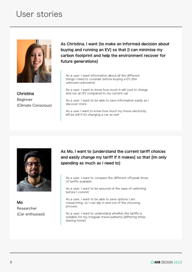

User stories created to support the design sprints - and to help with discussions with the business owners
ASSESSING THE EXISTING EXPERIENCE
Copy or evolve
In parallel to better understanding the target users, I was assessing how this new tool would fit within the existing experience framework.
I conducted a heuristic review and a number of issues emerged.
Immature design language
The existing site had various patterns and components being used for the same interactive and styling purposes. There was no structured design language.
Confidence and credibility
Parts of the experience were unexpected and would erode confidence in the whole proposition.
Information architecture
Key information was difficult to find, a challenge to digest and in some cases, inaccurate. This could be seen as missing an opportunity to support those personas we'd identified who were in a discovery mindset.
Clear proposition
It wasn’t immediately clear as to what the proposition was of rightcharge. Mindful of the new tool to be designed, the overall proposition and messaging would need to evolve and focus.
Usability
There were a number of other general usability issues which needed to be addressed, including disorientating user flows and inconsistent use of navigation.
However, these issues were out of scope for this project, so I recommended we move forward aligning as far as possible with the existing experience, while avoiding replicating existing issues.
COMPETITOR ANALYSIS
Comparison/ Energy/ Charge-point/ Other
User experience
I reviewed 10 comparison websites. Assessing the UX, interaction and behaviour of their respective comparison journeys.
Bulb - home
Blub - business
Octopus Energy
EDF
Confused.com
Money Supermarket
CompareTheMarket
GoCompare
EnergyHelpline
U switch

Screen grabs from the competitor flow analysis
Brand and style
I also reviewed various websites from a branding perspective, to start maturing the brand personality.
While it’d been established during the heuristic review, that the rightcharge brand required a deep-dive beyond the scope of this initial engagement, there was value in setting some early direction on the creative execution.
ENERGY PROVIDERS

DIRECT COMPETITORS
EV CHARGE POINT MANUFACTURERS

'LIKED' SITES

ENERGY PROVIDERS

PROJECT SETUP
Planning, team alignment and setting expectations
The final part of the project setup was to plan the sprints, set expectations as to rythyms and routines.
I used Trello to organised the project into four sprints.
Sprint 1
Project setup. Discovery and definition (above). Sitemap for access points to the new tariff tool.
Sprint 2
Design the comparison tool input journey.
Sprint 3 & 4
Design the tool's results experience and the interactivity/ behaviour of the results.
I set up daily stand-ups with the business owners and lead developer, and weekly sign-off points with the owners.

Screen grab showing the Trello board for rightcharge
THE SOLUTION
Sprint 1 - set up & access points
Sprint 1 involved the above discovery/ definition, and project setup activities and the second part - design of the access points to the new tool.
User flow
I drew up the user flow of the existing experience and identified points where it made sense to access the new tariff tool.
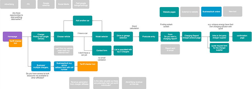
User flow of existing rightcharge website
Access points
I recommended to rightcharge that the new tariff comparison tool should be merged with the existing tool, which helps people choose the best charging equipment, rather than being treated as meeting a separate user need.
Insight from the research available on motivations for 'buying EV', showed that the primary need of the largest target segment of potential users - those new-to-EV - was information. Not just information about the types of vehicle, but on living with an EV over time, including taxes, running and servicing costs.
The existing tool required users to input certain personal information, such as car details, location and typical usage behaviours. The new tariff comparison tool would require users to input the same information.
So a person new-to-EV gathering information about living with an EV, would have to input the same information twice to receive two piece of important information - how to charge, and what it will cost to charge.
We explored what would potentially need to be changed to the existing tool, but due to prior PR communications which had been released and launch commitments made, increase design and build time with the added complexity of the merge, rightcharge decided to keep both tools separate - at this stage.
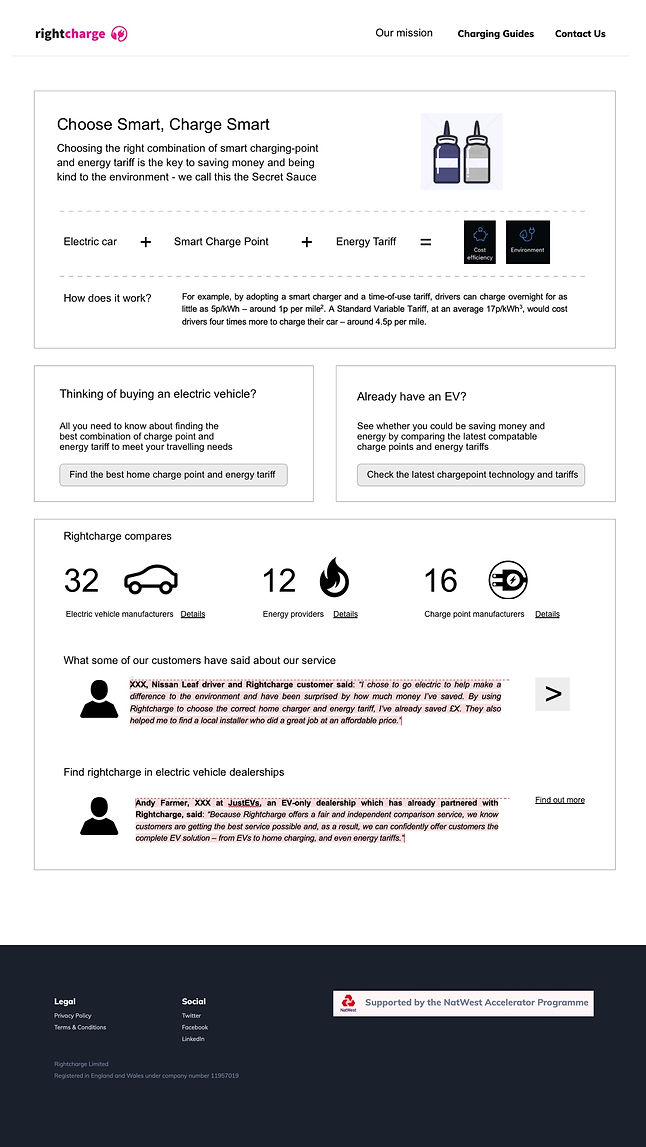
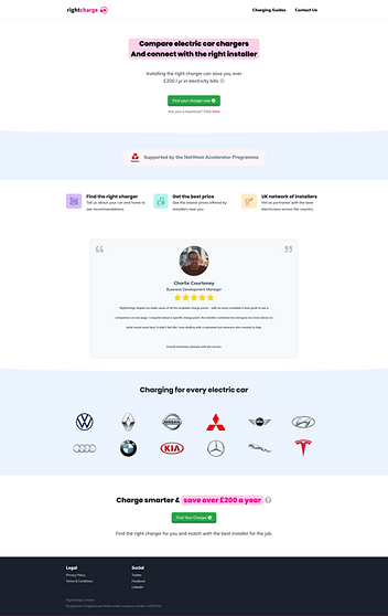
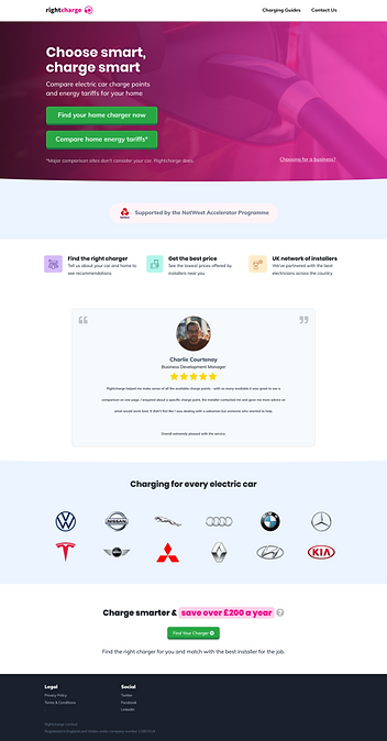
Homepage
The homepage obviously needed changing to contain an additional CTA for the new tool. We adjusted the copy to reflect what the owners wanted to say about the tool and I created a strapline - Choose smart, charge smart - which was adopted. I introduced a EV-related hero image to help bring some life to the brand.
At this stage the rest of the page remained the same.
EXISTING
NEW

Desktop
Mobile
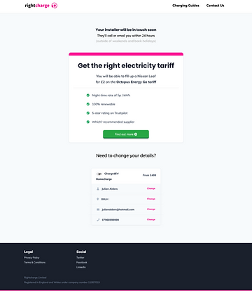
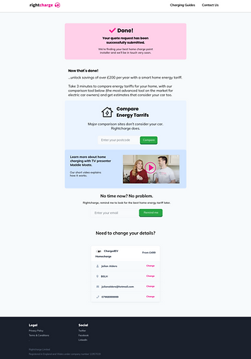
Post-quote page
This page is the final screen in the existing charge-point comparison tool.
I increased the presence of the success message, to give the user confidence that the form had been successfully submitted, and added a new component inviting the user to compare energy tariffs, where by inputting a postcode would take the user into the new tool.
EXISTING
NEW

Desktop
Mobile
Sprint 2 - the input journey
We went mobile first on the experience, in the expectation that a many target users would be researching EV's in spare moments of the day. The business also wanted users to have a very simple, bold and 'fun, youthful, playful' interactive experience, often referencing Bulb in how they took users through a comparison journey.
So, we simplified the questions to minimise time and simplify the process, enabling user's to answer by selecting large illustrated buttons (where possible) and grouped the questions logically between details about their house and details about their car/ the car they were thinking of buying.
We were going for making rightcharge feel fresh, contemporary and accessible, reflecting the EV market itself.
HOME DETAIL INPUT
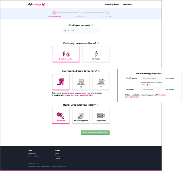
kWh manual input state
CAR DETAIL INPUT
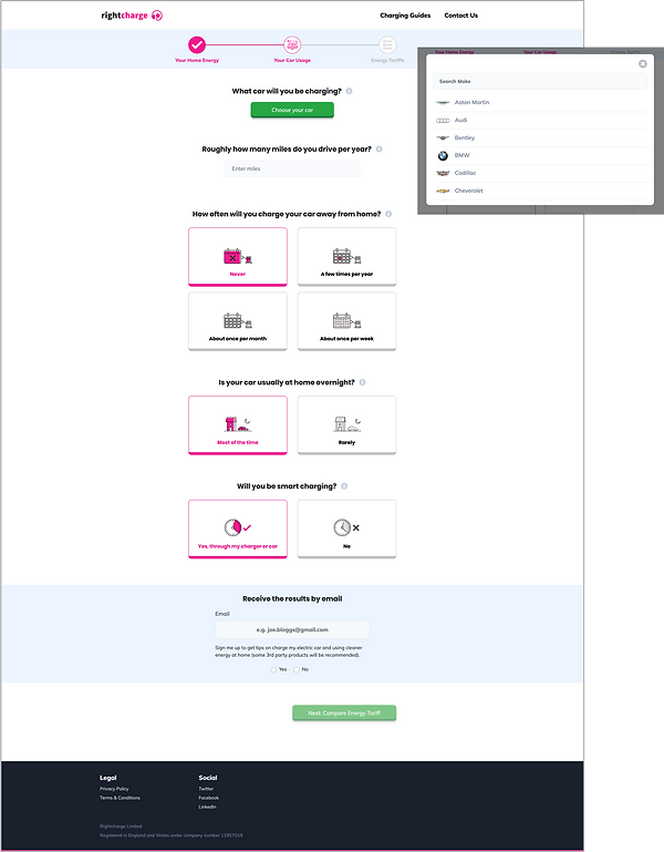
Car make/model input modal
The home input questions reflect certain industry default assumptions, calculations and results. For instance, stating the size of house, would reference industry standard figures regarding average energy consumption; or, the method of payment would determine which tariffs are included in the result set.
The car usage questions are more interesting. The input information was run through an algorithm designed to determine your likeliness and frequency to charge your car at home, and where you do, whether you are likely to be able to take advantage of off-peak tariffs. Combining this with the make and model of your (desired) EV, this understanding of user behaviour informed the recommendations returned and determined the order of the results by cost efficiency.
From this cost dimension a user would see a breakdown of the features of each tariff, including it’s environmental credentials and be able to adjust the input variables to see, understand and learn the impact which their travelling behaviour would have on the cost of energy usage.
This insight is expected to be of interest to all personas identified.
Sprint 3 & 4 - Results
The aim of this tool was to provide transparency as to what proportion of a single energy cost was split between running a home and charging an EV.
Up until this point, it was not easy for EV owners to find out how much of their electricity bill went towards charging their car. This tool would break down the cost between house and car, and better inform the EV owners/ potential owners.
By exploring varying factors relating to driving patterns, behaviour and hardware decisions (car and charge point choices), one is able see the impact on cost, availability of the greenest energy sources and be informed so as to make better purchasing and lifestyle choices.
rightcharge wanted this tool to be simple, accessible and clear, while allowing a user (maybe the tech enthusiast or savvy spender) to deep dive into the detail.
Invitation to explore, learn and decide
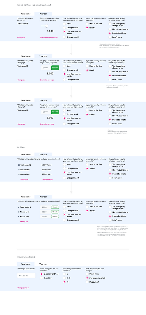
It was also important to allow the user to play with the figures, to see and understand the impact of their lifestyle and purchasing decisions on the options available.

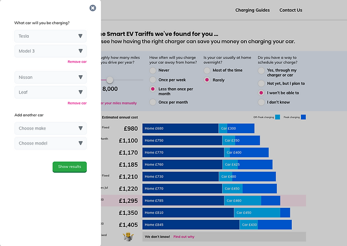
Screen grab of the results page
Ability to deep dive
Selection of a tariff reveals tariff tiles. These tiles provide detailed features about the tariff, including breakdowns of home energy usage.

Screen grab of the results page - showing tariff tile detail
Flexibility to explore from one place
The ability to make adjustments to the results without leaving the stage.
Extensibility
Ability to accommodate edge cases for multi-car ownership.
For those who want the detail
A pattern to allow for full tariff details to be displayed.

What's next
Phase 2
The next phase is to look at the overall business proposition, how the two tools overlap and other useful tools and services for those thinking of buying an EV, or those looking to get better control over living with an EV.
The brand positioning is also being reviewed, with an expectation that a complete redesign and production of a design language will need to be put in place to enable scaling of the business.